MY MEDIC
My Medic is one of the leaders in the first aid kit industry, yet lacked a coherent brand or clear voice to scale. I’ll be honest, I didn’t have much experience in the first aid world, but that didn’t stop me from helping in quadrupling their sales! I got hired to help rebrand and visually enhance their creative from top to bottom. This included revisioning their logo and branding, creating a new highly visual email strategy and sales-forward approach for email campaigns, adapting and reimagining their digital advertisements across all platforms (Facebook, Instagram, Google, Pinterest, YouTube, etc), and offering art direction for marketing campaigns, social media content, packaging design, studio product photography, and more.
CAMPAIGN DESIGN
CAMPAIGN DESIGN
FROM THE
FLOOR UP
After a few months at My Medic, I was promoted to Art Director to take over full creative control on all marketing collateral. Oh man I had a blast!
I designed each campaign to have a unique sub-branded aesthetic while respecting the core brand.
CAMPAIGN EXAMPLE 01
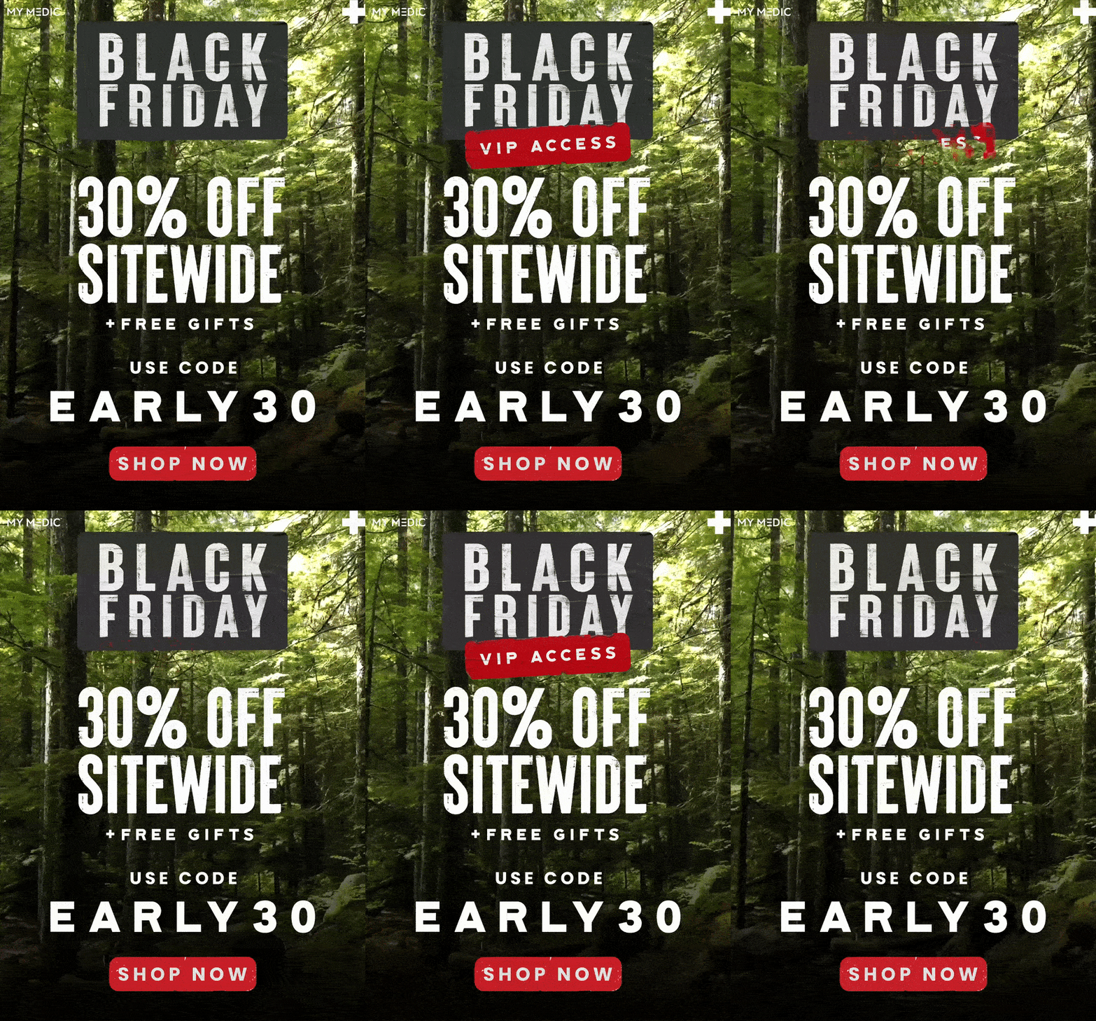
BLACK FRIDAY + CYBER MONDAY
-
Biggest sale of the year calls for the boldest campaign. Loud and flashy - overshadow the other guys!
-
Email subscribers. People that know what first aid kits are. People that don’t know what first aid kits are.
OVER THE TOP
I went all out for Black Friday. I ran with a rugged look that ties into our outdoorsy/tough-guy branding.
It’s a bit on the overly-designed side, but my marketing director wanted it to be over the top and very loud. I sure gave him a run for his money.
Movement
I decided to go larger-than-life with the cyber monday emails to refresh interest after black friday. I leaned into this cyber-neon look with custom animation throughout.
CAMPAIGN EXAMPLE 02
CORE KITS
Below are two examples of kit-specific email designs.
GALLERY
DIGITAL ADS
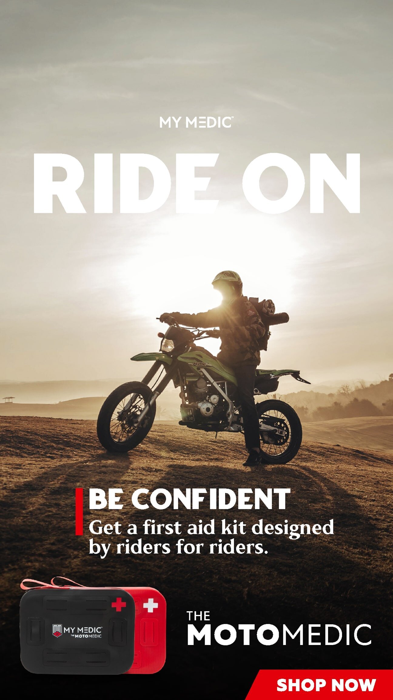
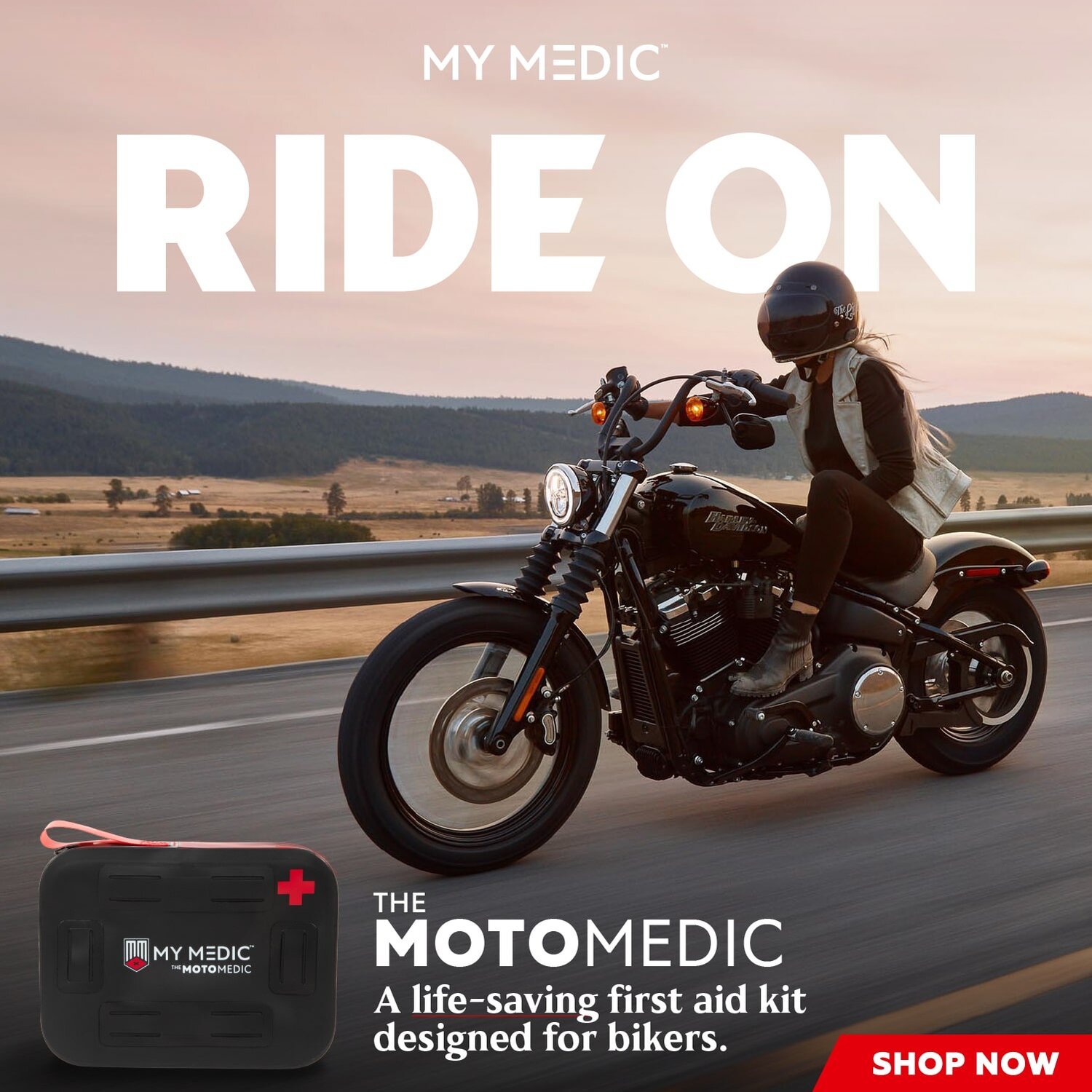
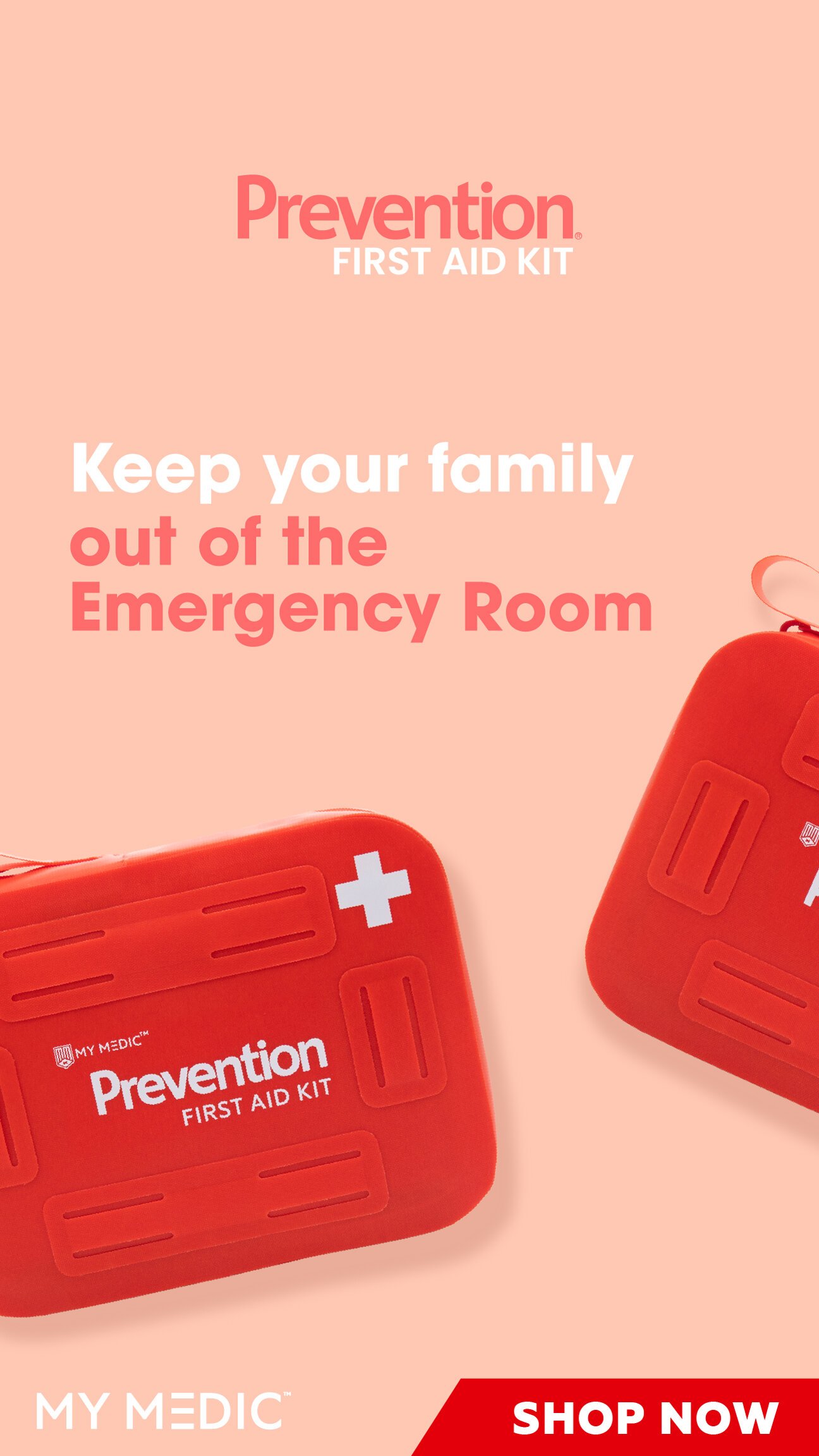
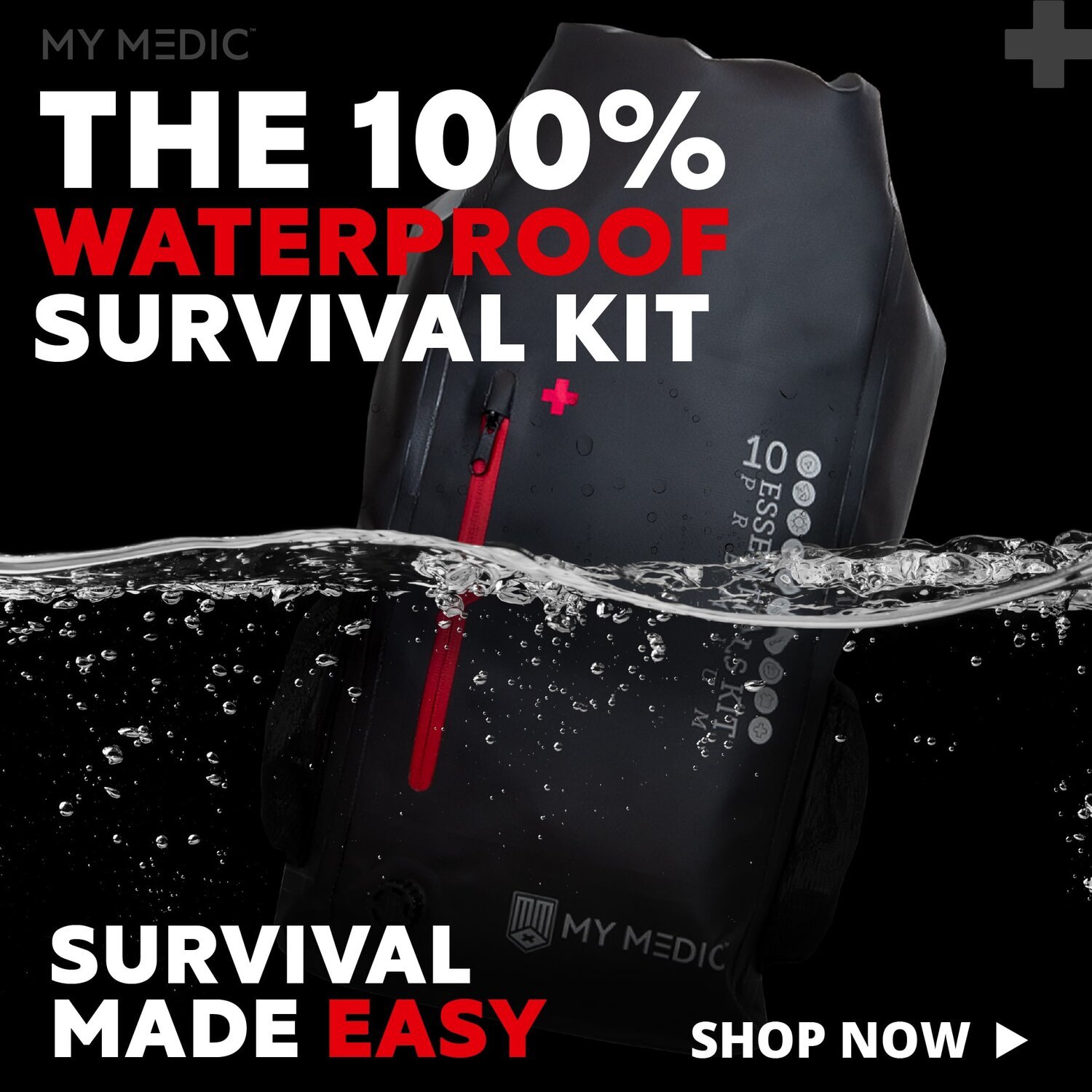
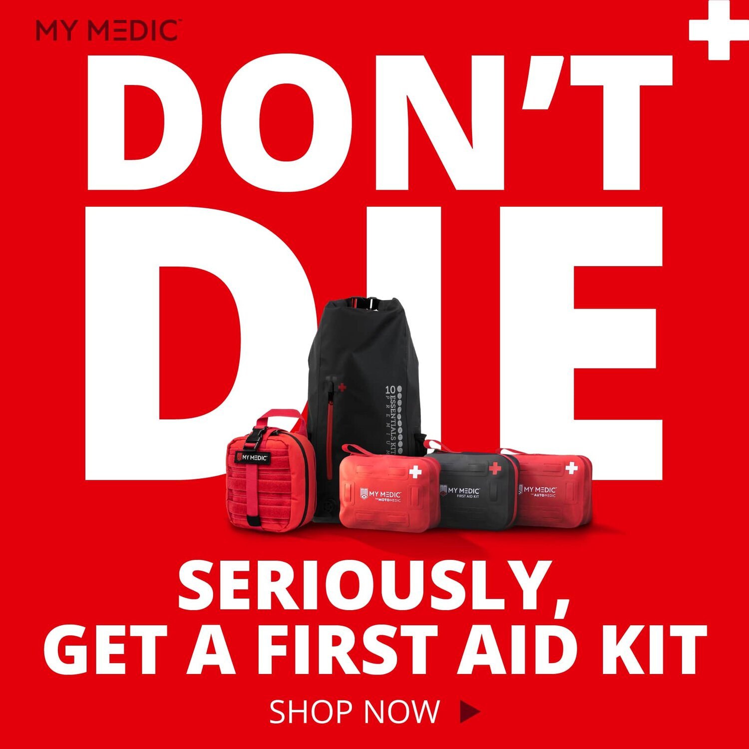
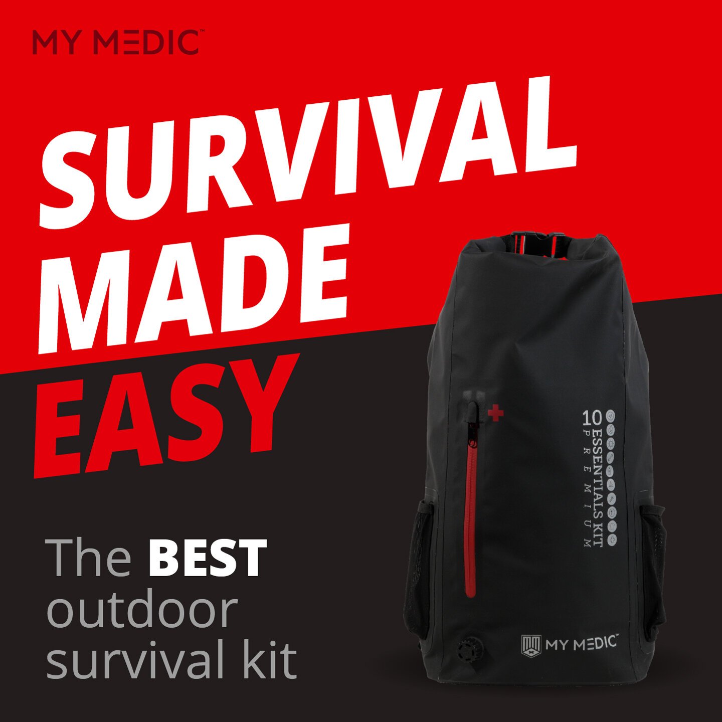
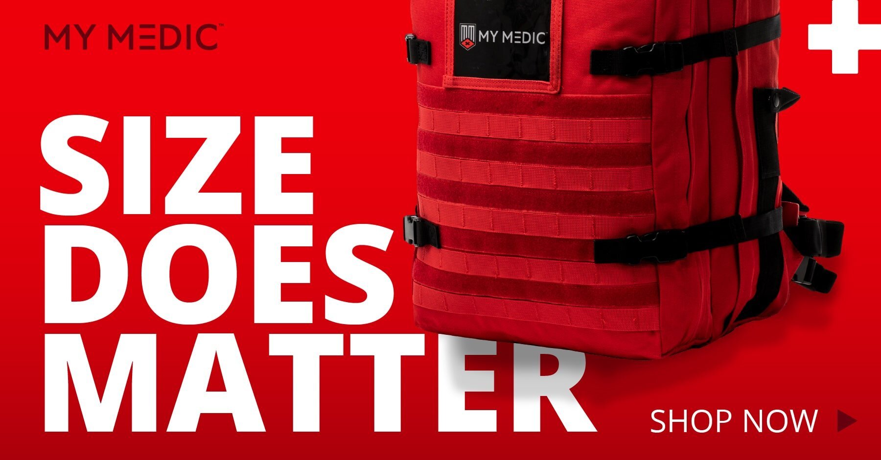
Here’s a collection of some of the high ROAS evergreen ads throughout the year.


