NOMATIC
Working for NOMATIC was a dream. NOMATIC is a travel product brand making the world’s most functional travel gear and luggage. I worked alongside a talented team in a tight-knit marketing team underneath the Art Director.
I was brought on to the team as the Graphic Designer & Content Manager to produce a wide range of creative assets.
A WHOLE LOT
OF ASSETS
Some of these assets include:
• Content for Social Media - Social media graphics for Instagram (formatted Instagram feed graphics, animated graphics for Instagram Stories), promotional graphics for Facebook/Twitter/YouTube, and photoshoot direction for product imagery.
• Online Marketing Materials - Web banner ads, Facebook/Instagram/YouTube/Twitter ads, email design (sliced graphics), website graphics, Amazon A+ Page design, Amazon Seller Central materials (Amazon Store graphics, Amazon promotions)
• Print Materials - Package design (hang tags, product box graphics), retail and POS graphics (one-page wholesale infographics, retail brochures), event collateral (flyers/brand awareness print materials)
PROJECT EXAMPLE 01
PETER MCKINNON PHOTOGRAPHY BAG
-
One of Nomatic’s most successful product collaborations. The campaign efforts aimed to be sophisticated, clean, and a little bit mysterious. “Apple” kept coming up in our marketing meetings.
-
Photographers that appreciate the best gear available. Photography industry vets. Peter McKinnon die-hards.
PIRATE PETE
So, immediately after joining the marketing team, I was put in charge of all of the Peter McKinnon campaign assets. They’ve been working on this collaboration for 3 years, and they had me come in for the last quarter of the game to help do it justice. It was a teeny bit intimidating, but I gave it my all and it went on to be their most profitable campaign yet.
Debut
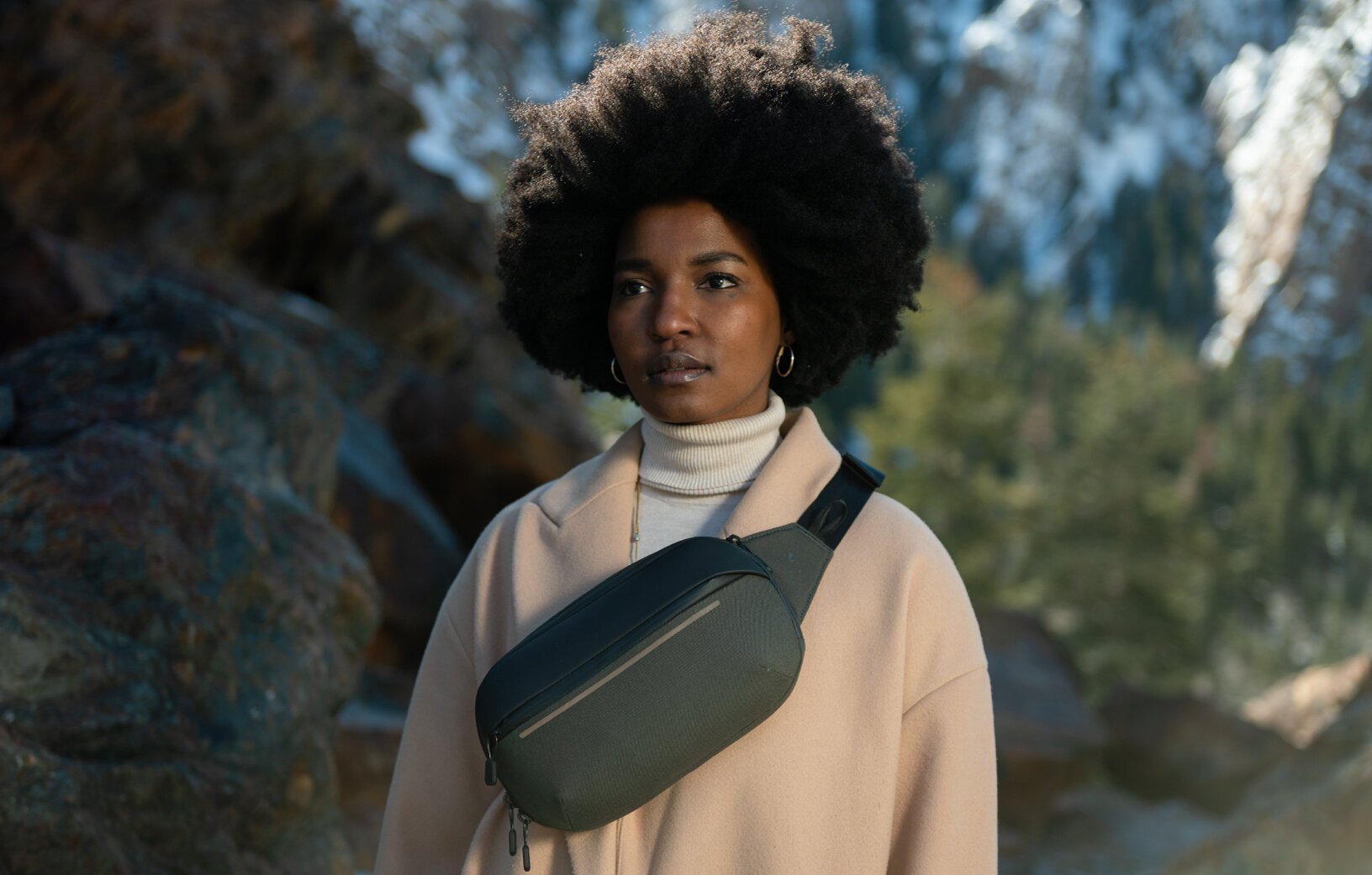
The Instagram carousel post that debuted the campaign. This is right when carousel posts came out so I was pretty dang stoked to see how I can make a cohesive slideshow.
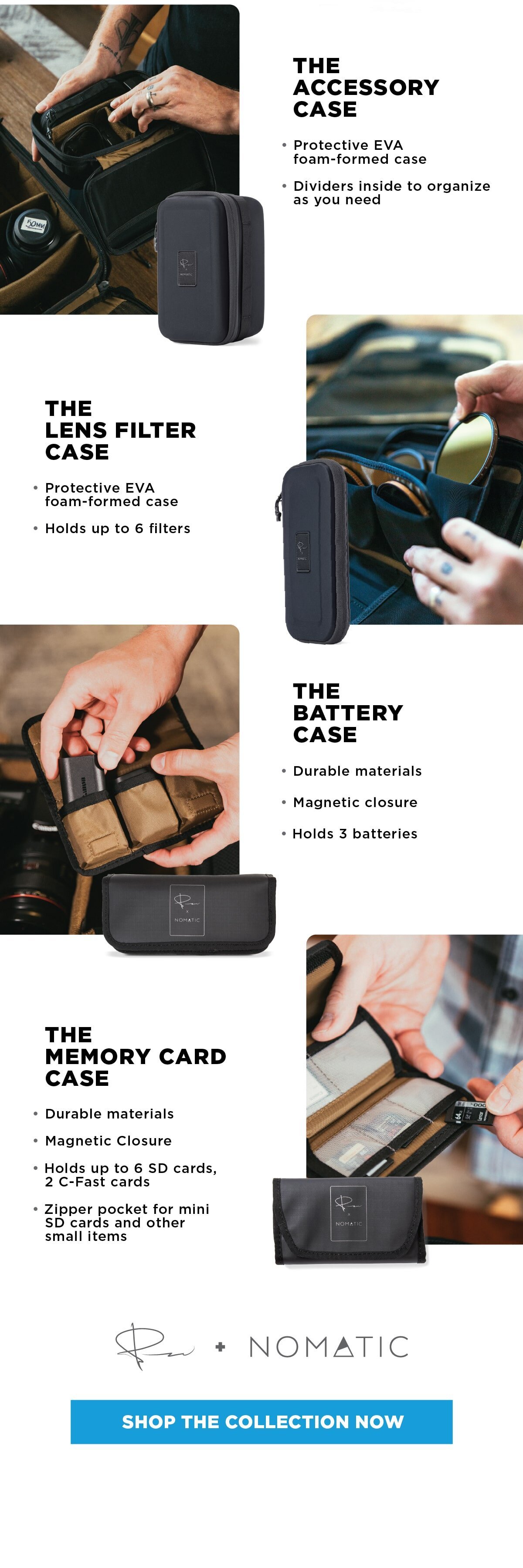
It was a unique challenge to make the email feel clean and spacious while also packing in a lot of info. It’s a tad on the long side, but I love how it came out feeling like a landing page with a lot of room to breathe and move through each product.
Getting this thang around the internet
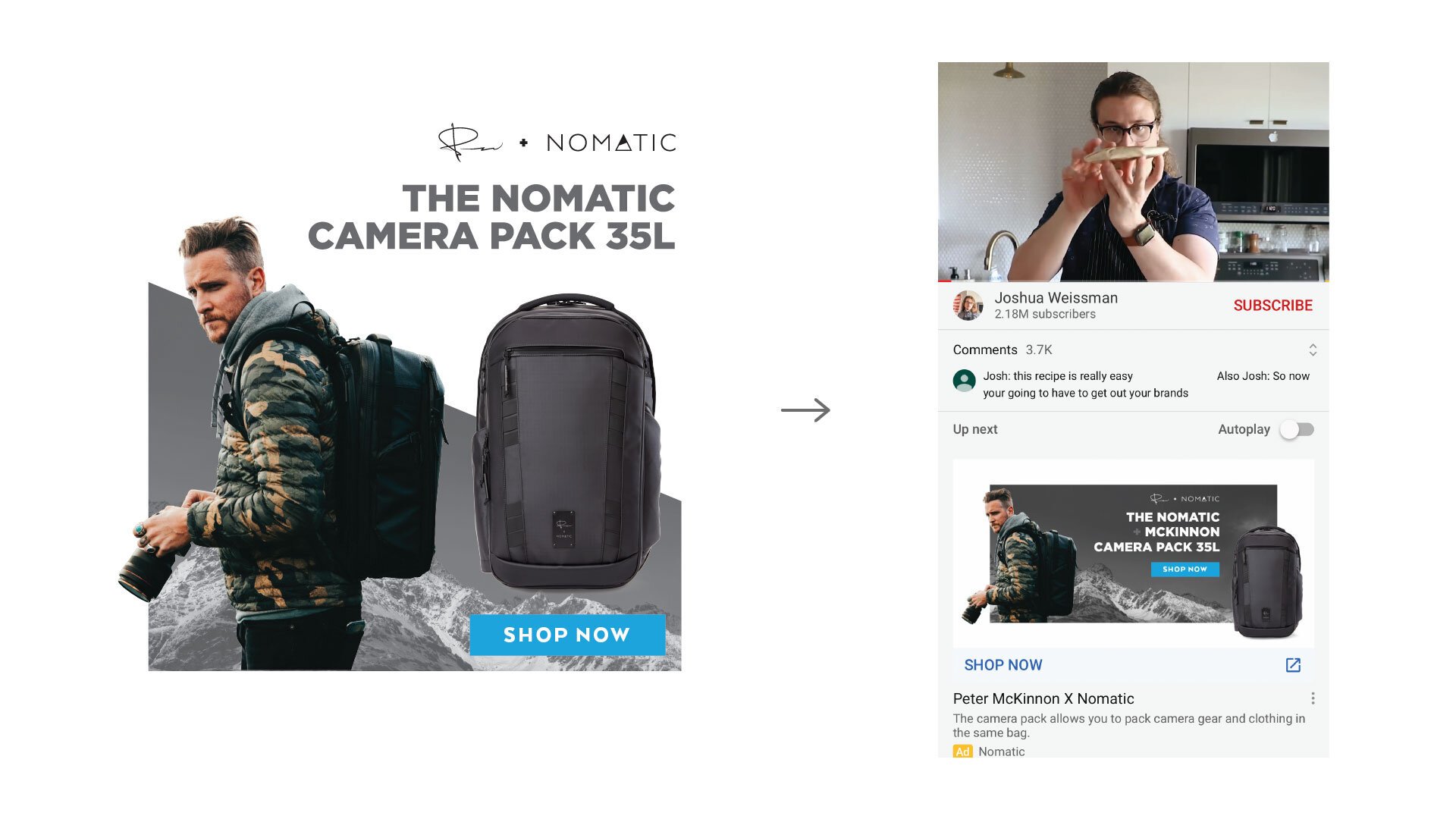
Below are a few ad placements for the launch.
And yes, Joshua Weissman is my favorite YouTuber.
PROJECT EXAMPLE 02
RETAIL
ONE-SHEETS
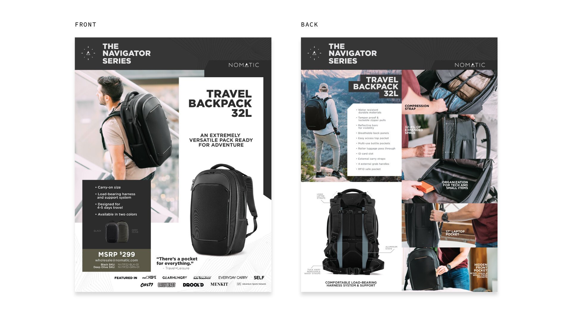
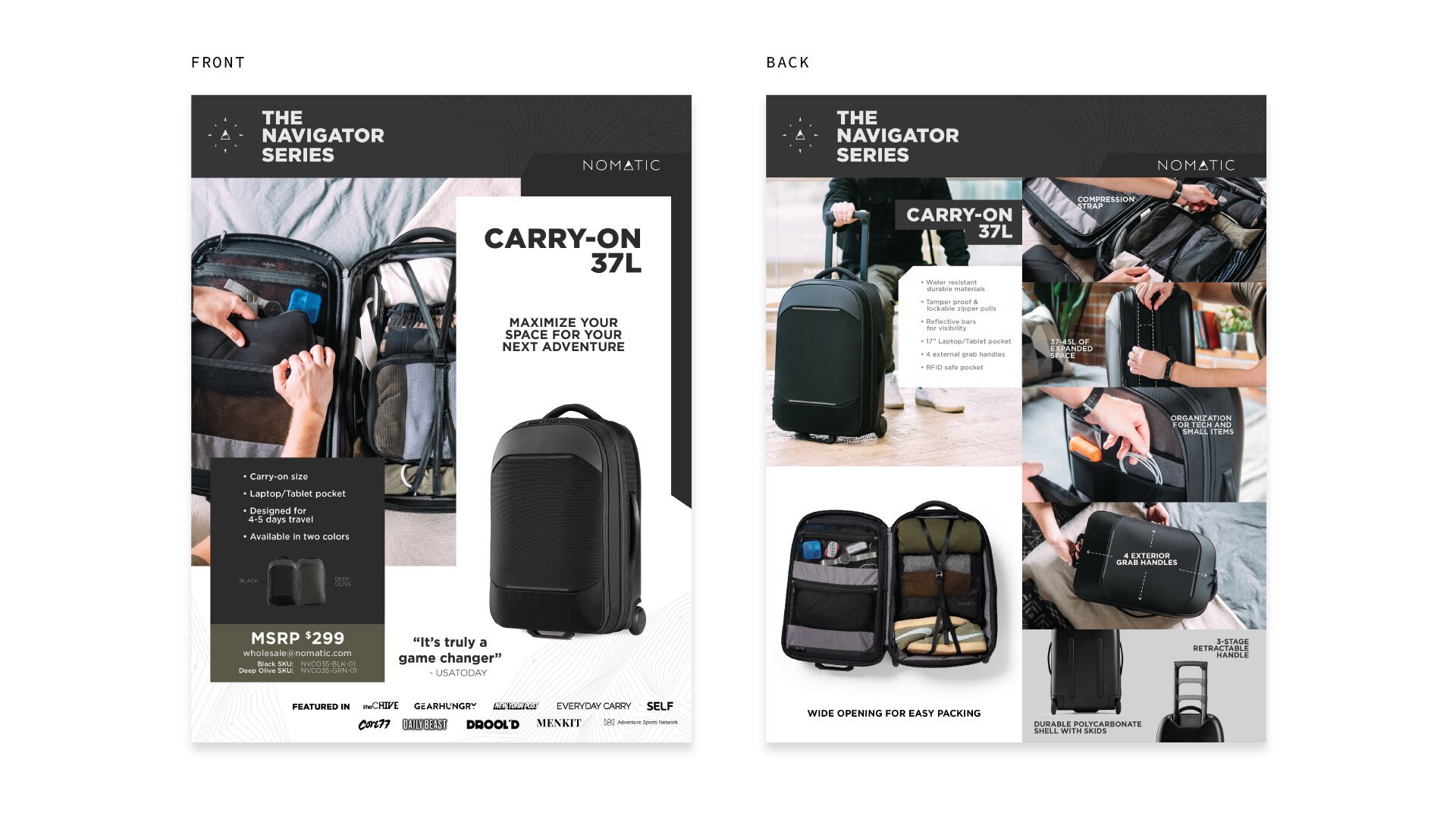
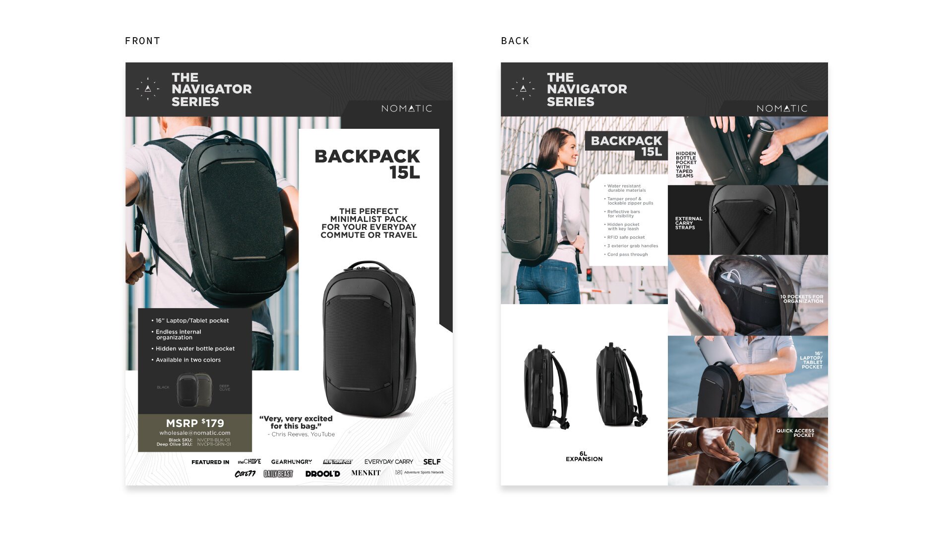
Below are examples of one retail one-sheets aimed to schmooze over retail owners.
PROJECT EXAMPLE 03
NAVIGATOR SERIES
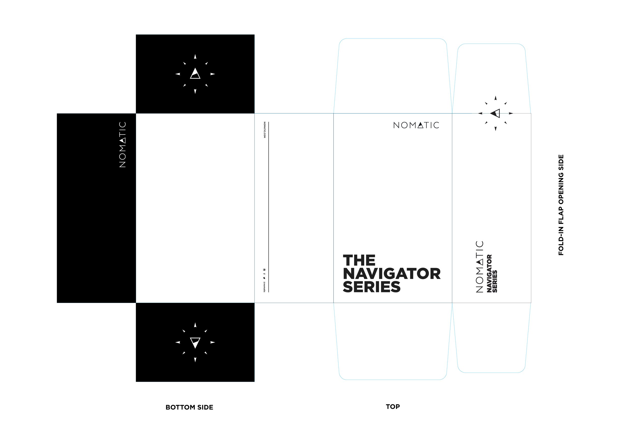
There was two things that the office talked about every day. One, all the predictions, gossip, and controversy surrounding the Utah Jazz… and two, the Navigator luggage series that has been in the works for over 2 years. I worked closely with the Art Director to conceptualize the unboxing experience, social posts, and email efforts.

